
Model Planning for Inference
Preface: What’s a Model?
We will spend most of this course learning to fit different kinds of regression models. What are they?
We will learn as we go. But as a starting point…
- In a regression model, we have one main response or outcome variable of interest
- We want to assess whether our response variable is or isn’t associated with (some of) a suite of possible predictor variables (also sometimes known as covariates but we’ll avoid the word “covariates” because it sometimes means slightly different things in different disciplines).
Essentially, we are looking to quantify relationships between our response and predictor(s) – accompanied by appropriate measures of the uncertainty of our estimates.
Section Learning Outcomes
This section, we will learn strategies for planning a regression model - how many variables, and which ones, should be included as predictors? How does an analyst decide? What principles underlie these decisions?
By the end of the section you will:
- Define a causal diagram, and the variable types that can be depicted in one
- Use a causal diagram to determine which variables to include as predictors in a regression model
- Apply the n/15 rule-of-thumb in model planning, to determine how many coefficients can be reliably estimated with a given dataset
- Combine a causal diagram, the n/15 rule, and a modeling goal to articulate a well-reasoned plan for a multiple linear regression model
Along the way, we will also review some introductory stat material on study design and types of experiments, to make sure we are all have the same vocabulary in place. You won’t be directly assessed on this material and so it is marked as optional.
Comic from xkcd
Text Reference
Recommended reading for the materials covered in this tutorial can be found in:
- Beyond Multiple Linear Regression Ch. 1.4-1.6
- Ecological Models & Data in R Ch. 9
- Course Notes Chapter 1
- Statistical Modeling: A Fresh Approach Chapter 18
- See also: A biologist’s guide to causal inference
It’s suggested that you read these chapters after doing this tutorial, with particular focus on the topics you found most challenging.
Sampling Strategies (optional)
Almost every dataset contains information on a sample of cases from a larger population.
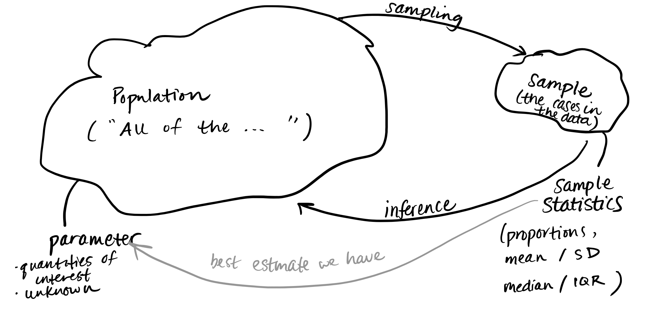
And if the sample is biased – that is, not representative of the full population in important ways – then we won’t be able to make any valid inferences from it. So the process used to choose a sample is crucial to the validity of all results! What are ways to choose a sample?
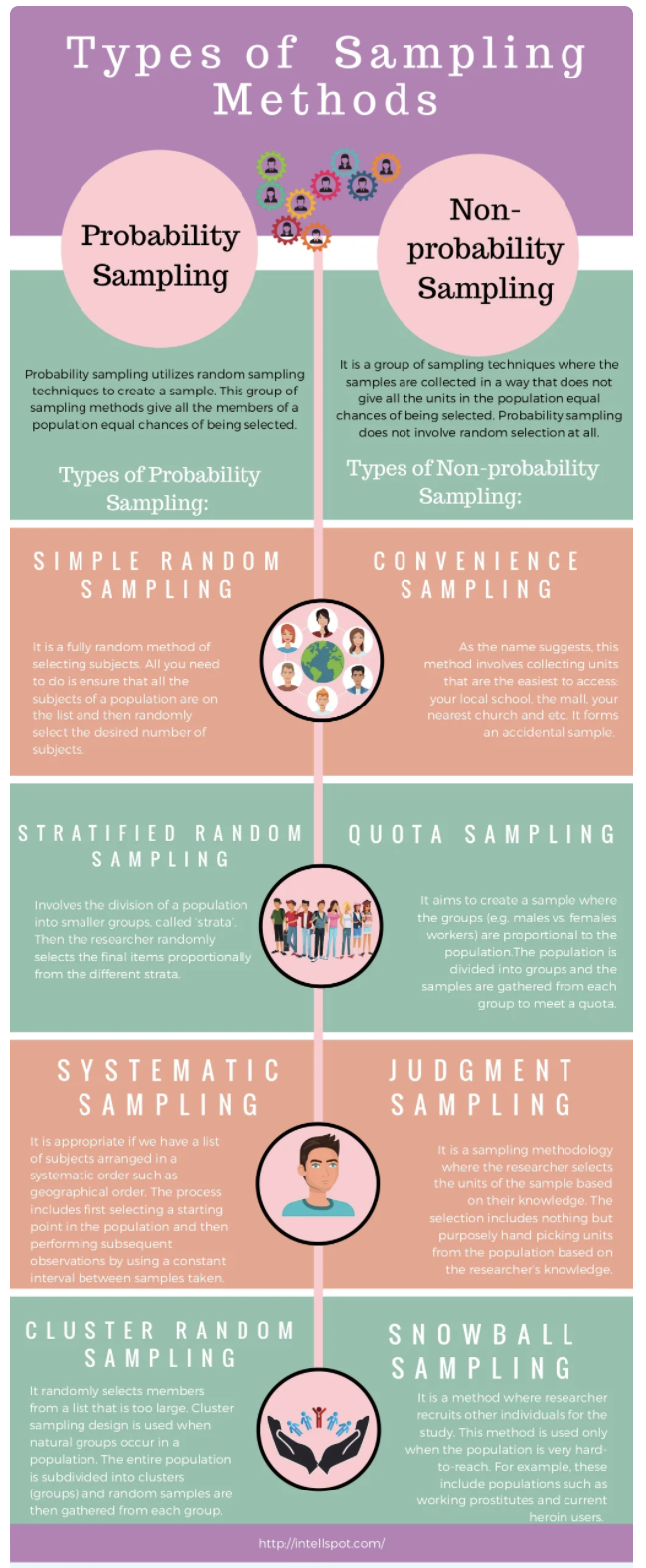
Sampling Infographic (optional)
Here’s an infographic version of the main ideas here, in infographic form. This infographic includes a couple additional sampling approaches that are used in human health studies, and also introduces one more bit of terminology: probability vs. non-probability sampling. In probability methods, there is some element of random selection that is used; in non-probability samping, there is not.
You can also view the infographic on the web.
Study Design (optional)
A crucial distinction is between two broad classes of research studies: observational studies and experimental studies.
Side note: many students in the sciences find that the statistical definition of an “experimental study” doesn’t mesh perfectly with the definition of an “experiment” that they learn in science courses. If it helps, you can think of “experiment” keeping the colloquial meaning it has in your field, and think of “experimental study” as a technical statistical descriptor of a study (as we will learn it today).
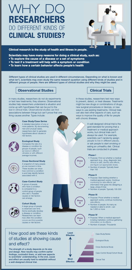
You probably have prior knowledge or a good intuitive guess as to the difference between studies that are observational and experimental. We’ll review key concepts more later on, but to start, take a chance to assess your existing hunches. Study the infographic below with this distinction in mind: Does the infographic confirm, modify, or add nuance to your initial idea of how “observational” and “experimental” studies differ? As a bonus, the image also details a few kinds of studies within each broad class, and orders them in terms of the strength of evidence they can provide.

An Alternative
You may spend less time with this one - but here’s an alternative infographic covering much of the same information. It’s organized differently, but consistent - dive in if you’d like to review again!
One thing to notice in this version is the emphasis on randomized experimental studies like clinical trials as a source of possible causal conclusions – the NIH notes that a randomized experiment has the best chance of allowing researchers to conclude that one thing causes another, while that is difficult to impossible in observational work. Why?
Why Randomization?
Randomization is a key tactic for ensuring the results of an experimental study are reliable, and providing a strong basis for concluding that a particular treatment or intervention causes a certain outcome or result.
Randomization means participants are assigned randomly to different “treatments;” they are randomly chosen to receive different assigned values of the key variable(s) that researchers are controlling or manipulating. If this procedure is not followed, then the different treatment groups may differ systematically in some important feature (like gender, motivation, initial health status - anything that might influence the outcome). Here’s one more video that explains the issue quite clearly, in the context of human randomized controlled trials:
You can also watch it outside the tutorial.
Random SAMPLE vs RANDOMIZATION
Careful! Many students confuse random sampling with randomization, or use one term when they mean the other. Check your understanding: which is which?
What is the difference between random sampling and randomization?
The words seem similar, but are distinct technical terms!
Randomization has to do with how values of a “treatment” variable of special interest are assigned: randomly!
Random sampling means that the individuals (whether they are people, places, or things…) in the study were selected from the population at random.
Observational vs Experimental Studies (optional)
We mentioned earlier that the key distinction for us will be between observational and experimental studies. Hopefully you’ve already started to form a mental map of the differences. Here’s one of the most clear, concise, complete statements of the main ideas I’ve ever heard:
You can also watch outside this tutorial.
And now, a one-minute review of the basics:
You can also watch outside this tutorial.
By now, you should be able to provide a short definition of each study type and note key differences between observational and experimental studies.
Even more
If you would like to know more about some of the other study types featured in the infographics but not discussed in detail so far, you can check out the optional video below:
You can also watch outside this tutorial.
Model Planning Motivation
Just as we imagine before we start coding to create graphics, we ought to think before we start fitting models.
Traditional ways of interpreting statistical results are premised on the idea that you made a plan, got some data, fitted the model you planned, and want to draw conclusions.
If, instead, you got data, scrutinized the data, fitted lots of different models, and now want to report results from the one that fitted best…well, generally things tend to go wrong. This is especially true if you use the data to lead you from a more complex to a simpler model. As Harrell (2015) points out in section 4.3, the problems are huge:
- Uncertainty underestimated (overconfidence: standard errors and confidence intervals too small, \(R^2\) too big, unfounded confidence that associations are real when they may not be).
- Spurious relationships look important and slope estimates are biased high
- If testing hypotheses, p-values too small
How can we avoid these problems? Some more insight will come when we consider model assessment and selection in future sections. For now, we need to remember:
Fitting and interpreting one well-considered, sensible model is prefereable to trying many things and then trying to choose among them later.
Response and Predictors
A regression model is our attempt to quantify how a response variable of interest changes when a set of predictor variables change.
So, to begin, we need to identify our (one) response variable – the thing we are most interested in measuring or predicting or describing or understanding.
Then, we need to identify a set of predictor variables that we expect to be associated with changes in the response. (If we are planning an experiment, they should be variables we can collect data on; if working with data already collected, they must be in or derived from the data available.)
How do we choose which predictors to include, and how many?
Expertise
First, rely on experts and previous experience. If you know the context of the problem well, you have a good sense of the predictors that will be of interest. If you don’t, then you should consult experts (or published work on the topic).
There are also practical limits on the number of predictors you can reasonably consider, given a dataset.
Dataset Size (n/15 rule)
One important consideration, when planning a regression model, is: How many predictors can I reasonably include?
It depends on the size of the dataset: it takes several observations to get a good estimate of any statistics, so it makes sense that fitting a model with lots of predictors will require a bigger dataset. Each additional observation may add a little bit more capacity for fitting a more complex model.
And if you try to fit too many, the chances of overfitting increase. Overfitting is when you model noise as well as signal, capturing in your model apparent relationships that actually exist only in the current dataset, not in reality.
For linear regression, Harrell (2015, Chapter 4.6) offers a rule of thumb: the number of parameters being estimated, \(p\), should be less than \(\frac{n}{10}\) or \(\frac{n}{20}\). To give just one standard rule of thumb, we should aim for \(p < \frac{n}{15}\). \(n\) is the sample size (number of rows in the dataset).
This “n/15 rule” is a very rough rule of thumb - sometimes it seems you can get away with estimating a few more parameters than it says, and sometimes fewer (particularly in the case of categorical predictors where the observations are not evenly distributed across combinations of categories). But it gives us a reality check and a starting point for planning.
Remember, n/15 is a ceiling – and upper limit on the number of parameters you could estimate. It’s not a goal! You may have less.
Causation Revisited
In most intro stat courses, students learn to repeat statements like: “Correlation doesn’t imply causation, and only randomized experimental studies can draw causal conclusions.”
Well…kind of.
In data science, big observational datasets (collected in the absense of a structured study design) are really common. There are also many scenarios of interest where randomized experiments are just not possible on practical and ethical grounds.
Some blatant examples: experiments in which people were randomly assigned to dislocate their shoulders to investigate factors influencing recovery, or start smoking to see if they get cancer, or expose themselves to someone with a contagious disease to see if they become ill. In many situations, observational work is the only real option. What’s a researcher to do?
In recent decades the field of causal inference has made great strides in thinking intelligently about how best to make the most reliable conclusions possible about cause and effect, when observational data is all you have. To begin to understand, we have to define a few terms: direct causation vs. indirect causation, and three alternative situations: confounders, mediators, and colliders. This field is new and technical, but the next video is about the most concise and clear primer I know of (with concrete examples).
You may also watch it outside this tutorial.
Mediators, Moderators, Precision Covariates
OK, wait a sec. The video didn’t cover mediators! A mediator is another term for what the video called an “indirect cause” – a link in the middle of a causal chain. The mediator explains or is part of the process by which an upstream cause leads to an effect.
There are two other variable types it may be useful to name, too:
- Precision covariates affect the response variable of interest, without having any causal links at all to the “main” predictor of interest. We include them in models when we can, to get more precise estimates.
- Moderators interact with the main predictor of interest. The cause-effect relationship between the main predictor and the response varies depending on the value of the moderator variable. (Moderators might additionally affect the predictor and/or the response directly, so they may share some features with precision covariates and confounders.)
What’s a Causal Diagram?
A causal diagram is a picture mapping the causal relationships between key variables. They are used when researchers are interested in quantifying causal relationships between variables – not just, “is X associated with a change in Y?” but “does X cause a change in Y?”
To make causal conclusions with confidence outside the context of a randomized, controlled experimental study is a big challenge, and mapping out starting assumptions about relationships between variables is just the first part.
Even if we are not necessarily trying to make causal conclusions (we won’t be here, with observational data), when you model relationships of several variables, a causal diagram helps you make smart, thoughtful choices about the ones you include in your model and the ones you leave out.
The diagram surfaces your starting assumptions about relationships between variables. It makes your assumptions transparent (to others and to you!) and guides choices about what to include/exclude from a model.
People also call causal diagrams DAGs (for Directed Acyclic Graphs) since they are a specific application of that [broader] type of mathematical graph. So, every causal diagram is a DAG, but in math there can be DAGs that are not statistical causal diagrams.
In a causal diagram each box is a variable, and arrows connect causes to effects (with the arrowhead pointing from the cause to the effect).
–>
Variable Types
In a multi-variable analysis, there is often one key variable of interest (measuring “response” or “outcome” or “effect”) and another one which may influence it, and is the focus of greatest research interest (a key “predictor” or “cause”).
But there are generally other variables in the mix that are somehow relevant to understanding the predictor – response relationship. How can we classify (and diagram) them?
In all examples below, X is the predictor of greatest interest and Y is the response. (A is the other variable.) The definitions below all depend on a specific X and Y having been chosen: the other variable types are defined relative to the X-Y relationship.
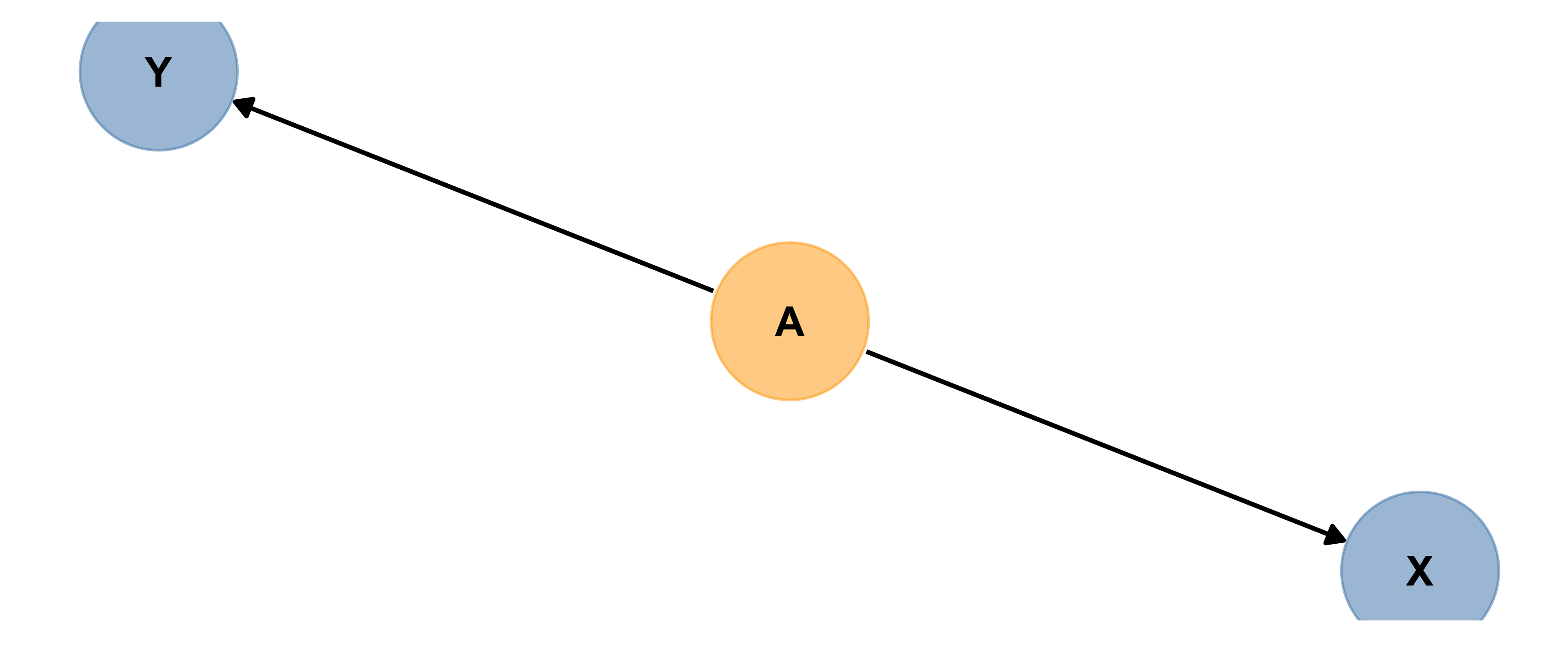
Precision Covariate
Here’s an example of A acting as a precision covariate. Precision covariates are also known as competing exposures.
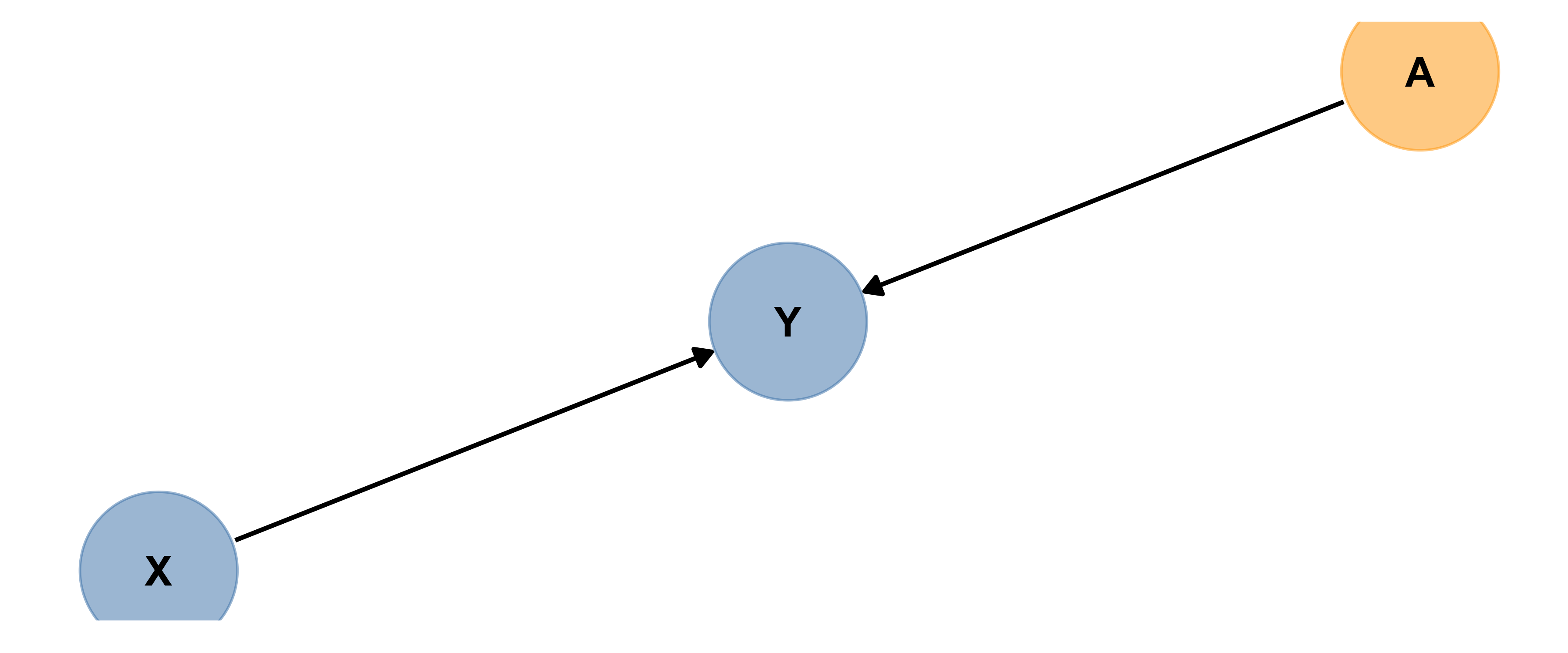
Based on the diagram, can you explain in words what a precision covariate is?
A precision covariate affects only the response variable.
Best practice is to include precision covariates in a model trying to measure the size of the effect of X on Y, to get the most precise estimates possible…but if you don’t, it won’t bias your estimate of the size of X’s influence on Y. Can you explain why?
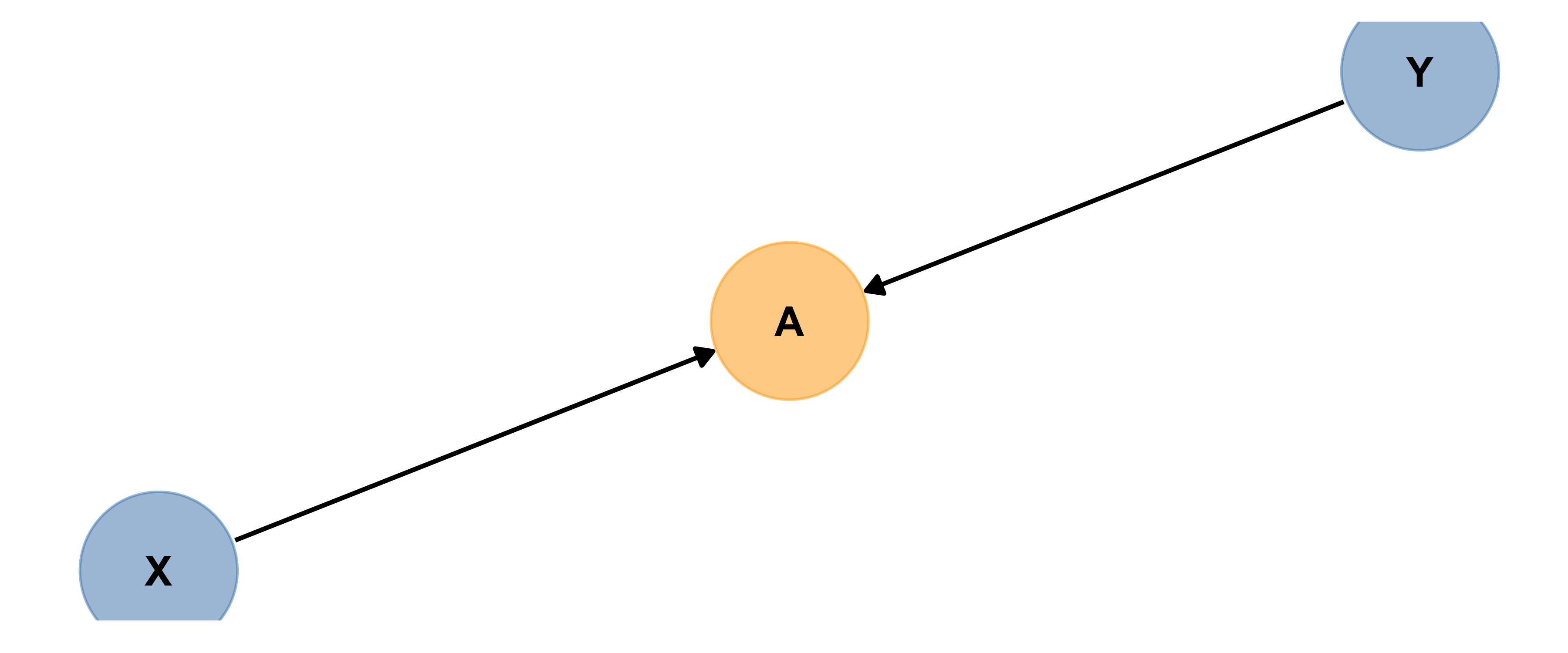
Mediator
Here are two (slightly different) examples of A acting as a mediator. Based on the diagram (and the code), explain in words what a mediator is.
Based on the diagrams, can you explain in words what a mediator is?
A mediator is part of a chain of causes and effects, between the main predictor of interest and the response.
(You may also see mediation chains elsewhere in a diagram/scenario…for example, a chain of three causes/effects that together act as a precision covariate.)
How is this different from a precision covariate?
A mediator is part of a chain of causes and effects, between the main predictor of interest and the response.
It affects the response, but unlike a precision covariate, it’s also affected by the predictor of interest.
If you have a situation like the first picture above, where there are no branches/only one single path from your predictor to the response, include only your predictor and that’s it.
BUT if there are mediator(s) and if there are branches in the path(s), like the second picture above that’s when you have options.
If you want to estimate the total effect of the upstream predictor of interest, exclude the mediator(s). If you want to distinguish and quantify effects along several pathways (via the mediator in question, and another way), then include one variable along each branch whose influence you want to measure.
Both can be valid. Researchers have to choose which they want to do.
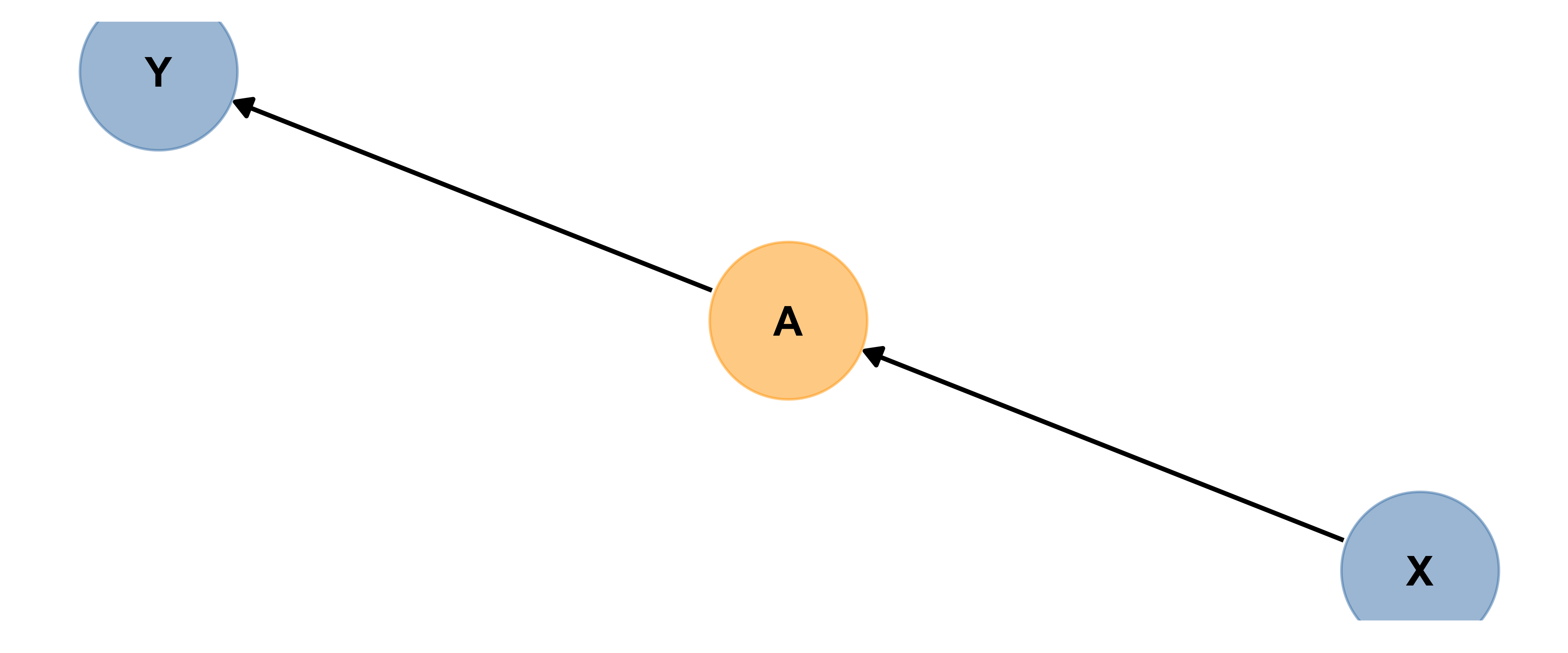
Confounder
Below is another causal diagram, in which A is a confounder.
Can you define “confounder” in words?
A confounder affects both the predictor and the response.
If there is a confounder present and you do not include it in your model, then you may wrongly conclude X causes Y.
So best practice is to include all confounders in a model.
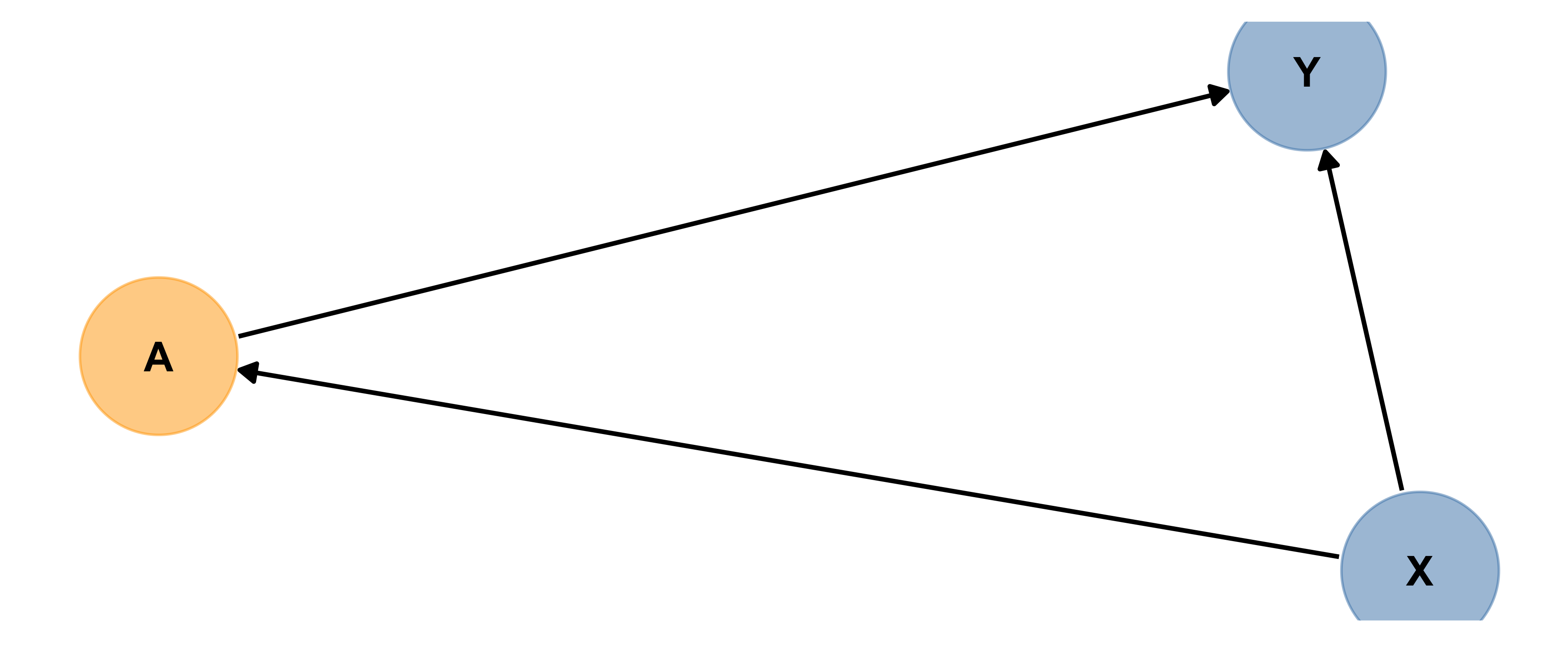
Collider
Collider bias caused by collider variable A looks like:
A collider is affected by both the predictor and response. (Their influence arrows “collide” at the collider…)
Including a collider in a model designed to measure association between X and Y can induce association where there is actually none so best practice is to make sure you do not include colliders in models.
Moderator
A variable that moderates (increases or decreases the size of) the causal link between two other variables is a Moderator.
(If you have studied interactions before in the context of regression models, a cause and a moderator interact to influence the effect.)
Unfortunately in our diagrams there is not really an adequate way to draw moderators – for good reasons – but here’s a diagram (from Yoon 2020) to help get a sense of the situation:
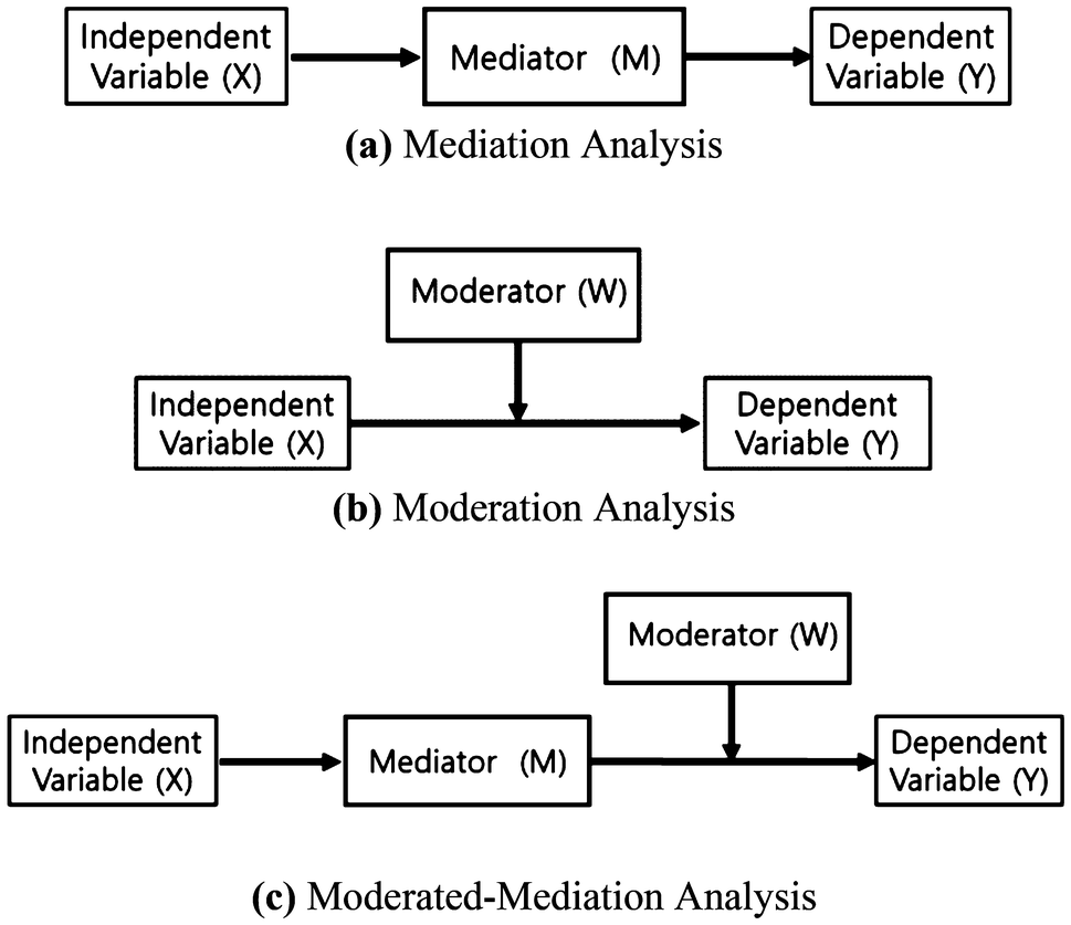
If you think you have a moderator variable, best practice is to include it in your model interacting with X. (We will return to interactions in much more detail later on.)
More
There are more details and more complicated scenarios, of course. This is all you need to master to start with. If you want to explore more, check out https://cran.r-project.org/web/packages/ggdag/vignettes/bias-structures.html
More Reference & Drill
Check out the materials and interactive questions at: http://dagitty.net/learn/graphs/roles.html
Summary: Causal Diagrams
Soooo….what? How will this affect our work? Well, we will often be interested in the association or relationship between two key variables, a potential cause or “predictor” x and a potential effect or “response” y. Unless we have data from a randomized experimental study, we need to be clever about which other variables to include in our analysis to get the best, most accurate estimate of the x - y relationship:
- If there are any confounders we should include them in our models and analysis. This is often called controlling for the confounders’ effects.
- If there is a mediator, you may have a choice.
- If there are no branches/only one single path from your predictor to the response, include only your predictor and that’s it.
- If there are branches in the path, that’s when you have options. If you want to estimate the total effect of the upstream predictor of interest, exclude the mediator(s). If you want to distinguish and quantify effects along several pathways (via the mediator in question, and another way), then include one variable along each branch whose influence you want to measure.
- If there are any colliders they should not be included in our models and analysis - including them would actually reduce the accuracy of our assessment of the x - y relationship
Seems simple enough, right? There’s a catch. To decide whether something might be a collider or a confounder, you have to rely on your knowledge or belief about what causes what. Even experts don’t always agree. There is not usually a definite right answer that is easy to agree on. This is one thing that makes causal inference with observational data so hard, and contentious!
But closing your eyes to the issue and skipping the step of making a causal diagram doesn’t solve anything at all. Whatever model you fit is consistent with some causal diagrams, and not others. So by drawing the diagram as best you can, and designing your model accordingly, you are being transparent and explicit about your assumptions instead of keeping yourself and your audience ignorant that those assumptions exist, and have consequences.
My personal advice is: if in doubt, and if the data allow it, control for all the potentially important variables you can. The exception, of course, if is you are sure or quite sure the variable is a collider - in that case you definitely MUST exclude it.